
Drayton Harbor Oysters Rebrand
February 2026
A conceptual rebrand for a local seafood restaurant, up in Blaine. Reworked visual identity, logomark, patterns, and print.
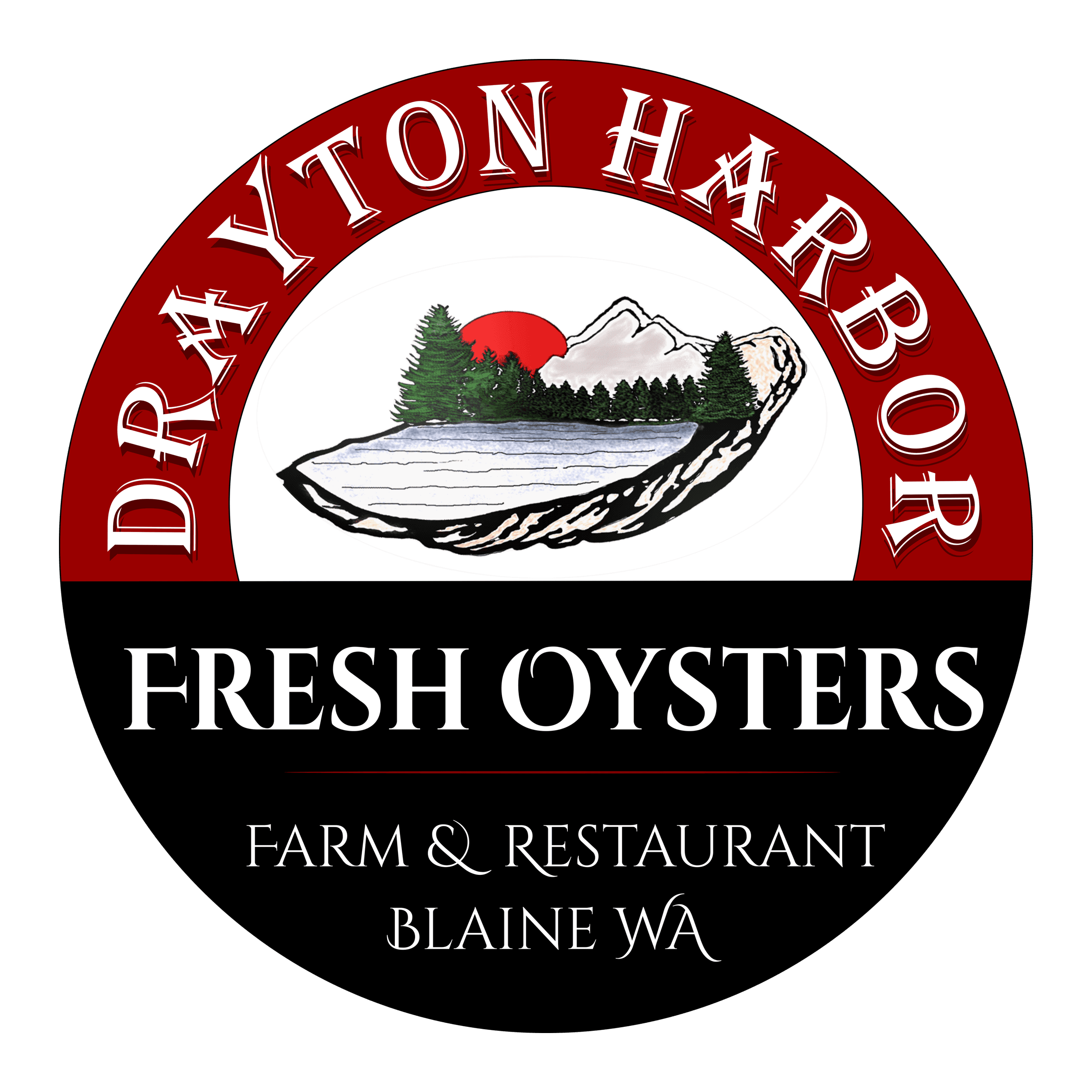
The Before
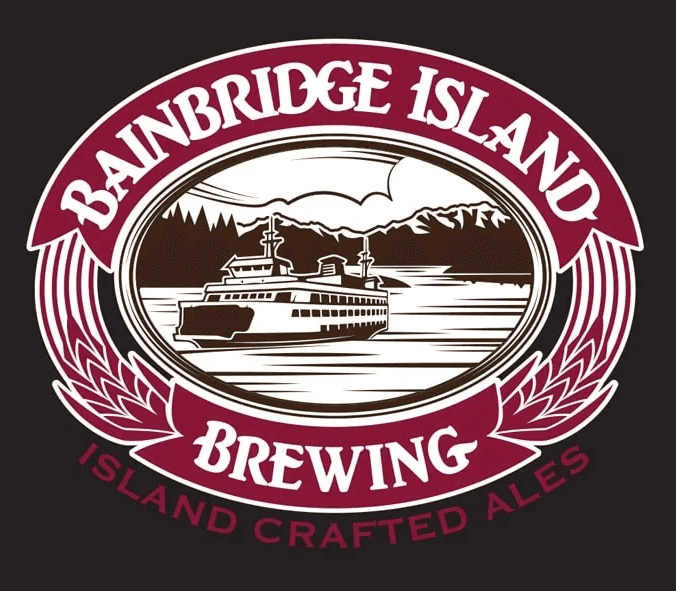
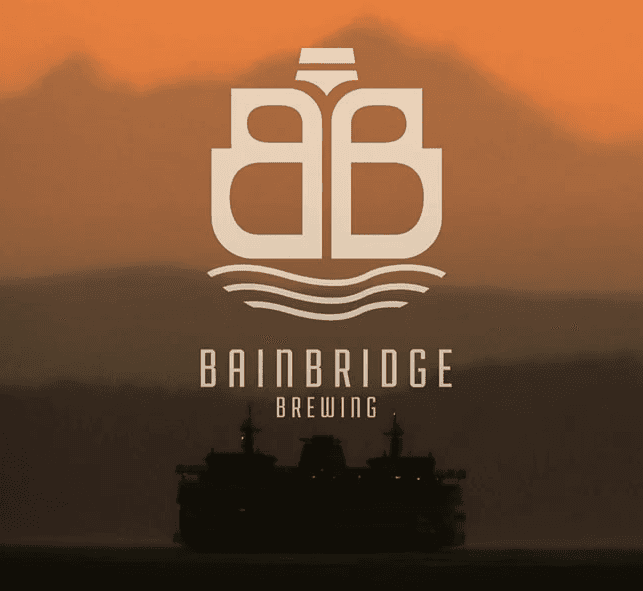
Initially, I was drawn to the brand for its resemblance to the old logo a local brewery in my hometown of Bainbridge Island. Bainbridge Island Brewing underwent a rebrand in 2015, modernizing and uplifting the craft beer taphouse into a distinct league of its own. This was the success I wanted to bring to Drayton Harbor.

Impressions
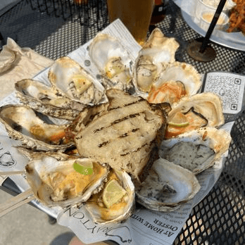
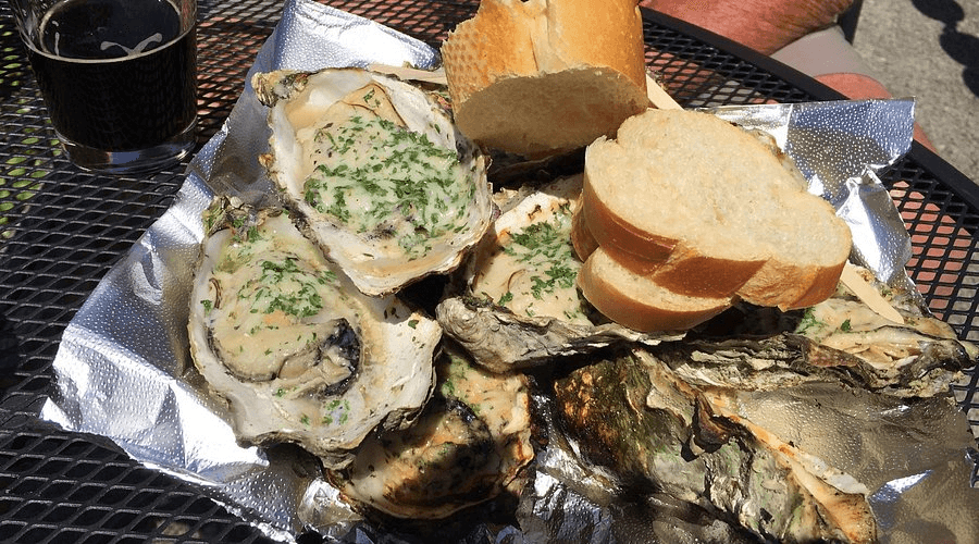
Drayton Harbor Oysters is your classic local spot. Residents of Blaine know where to go when they need an afternoon of freshly farmed oysters, brought up right there in the bay. With the craft and dedication I saw in their work, I wanted to provide a rebrand that was bright, fresh, and in-tune with their work.
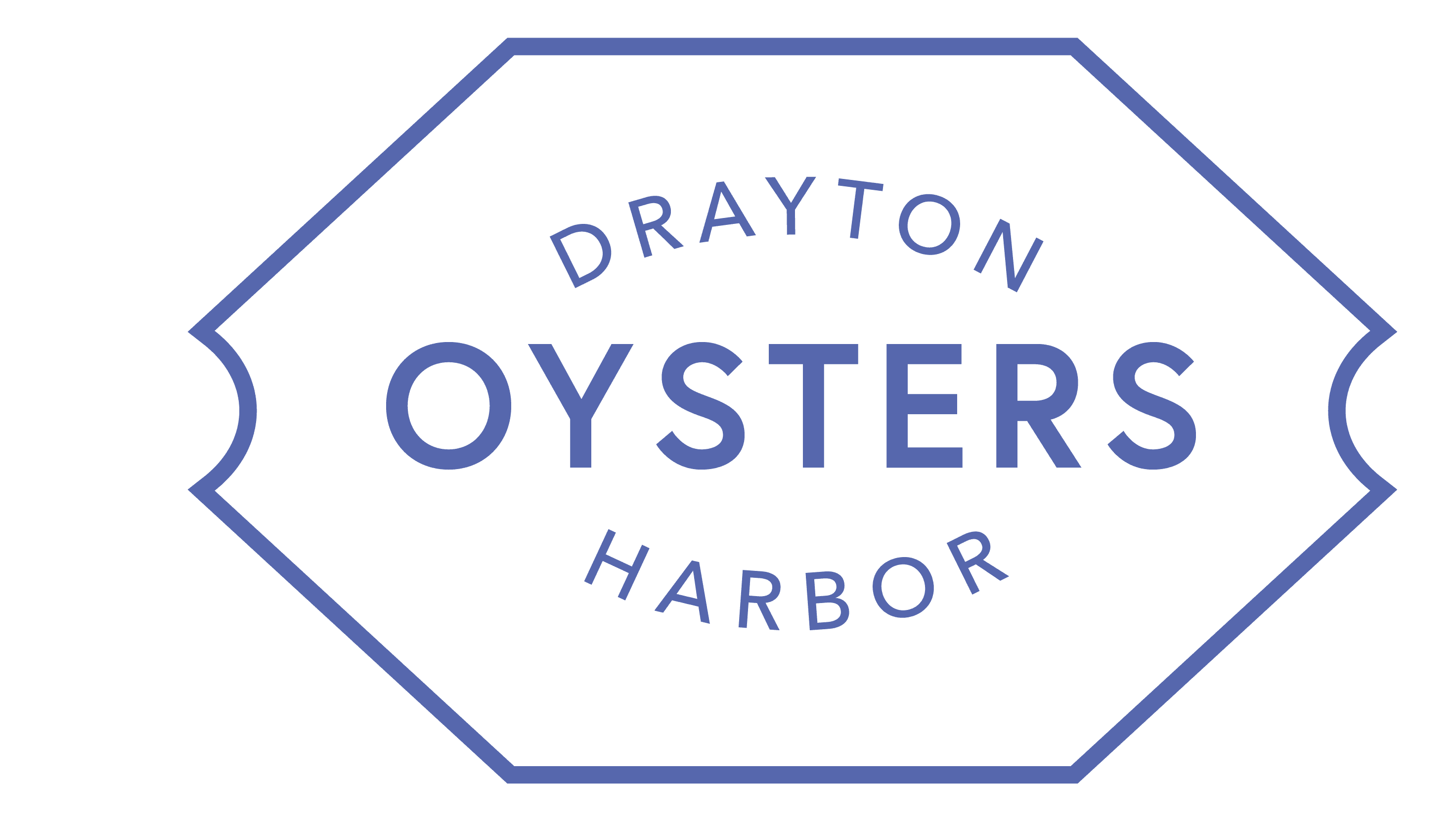
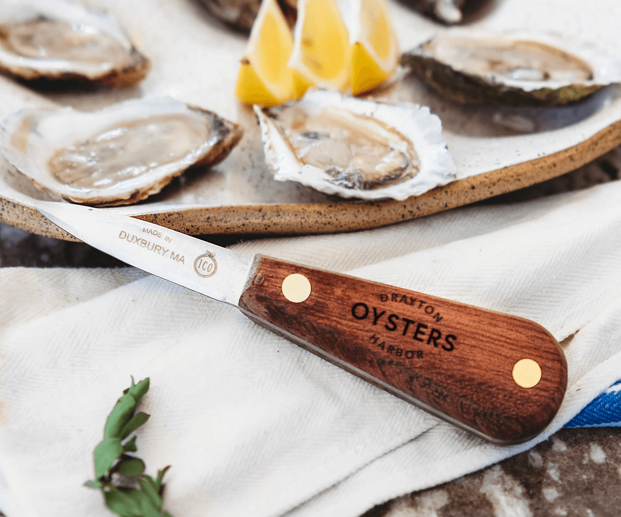
Primary Mark
Evoking the classic bivalve structure, simply stated and effective. Type was given the same thought process, a foundation to stand on, letting the food do the talking while still feeling local and approachable.

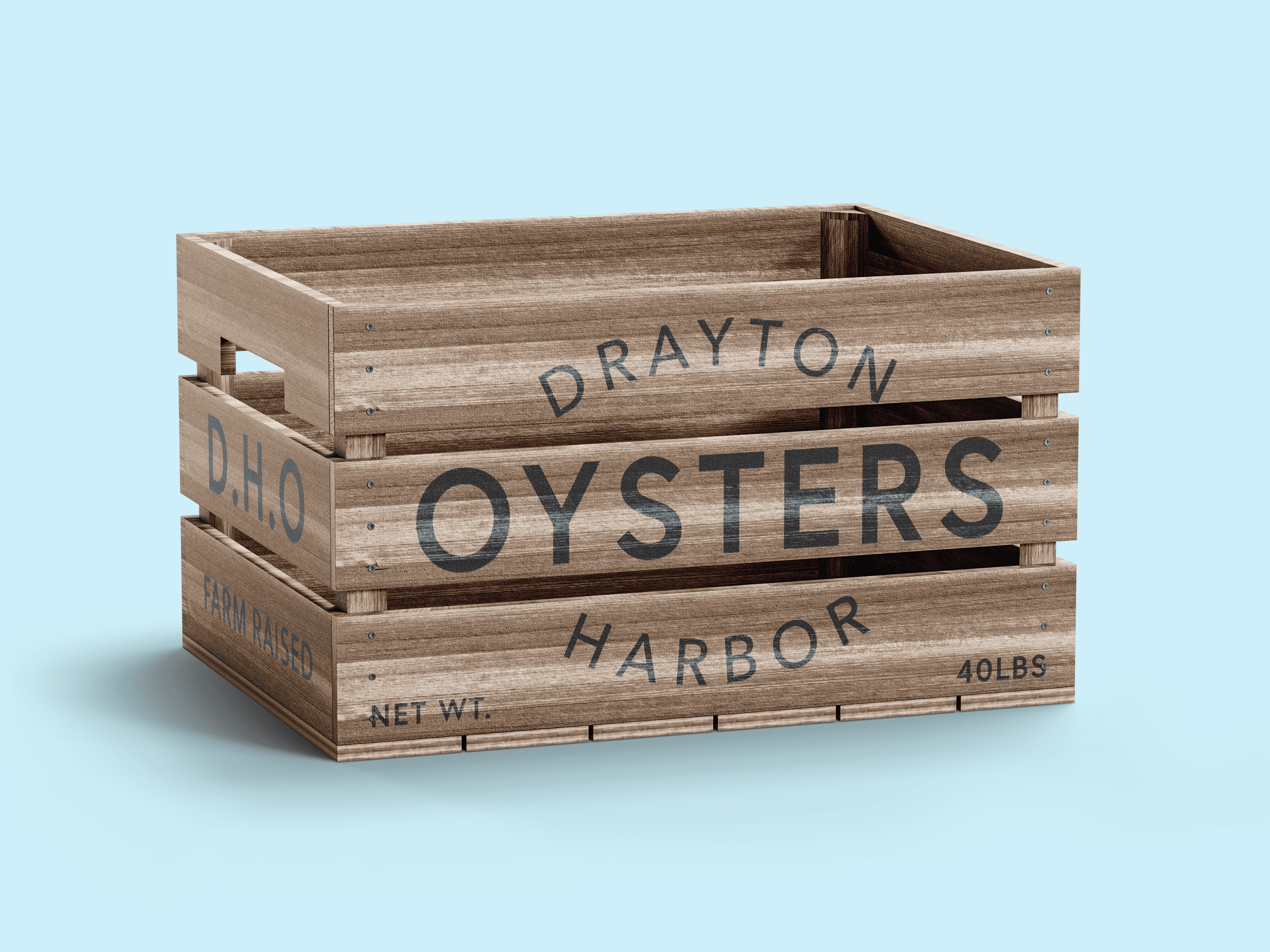

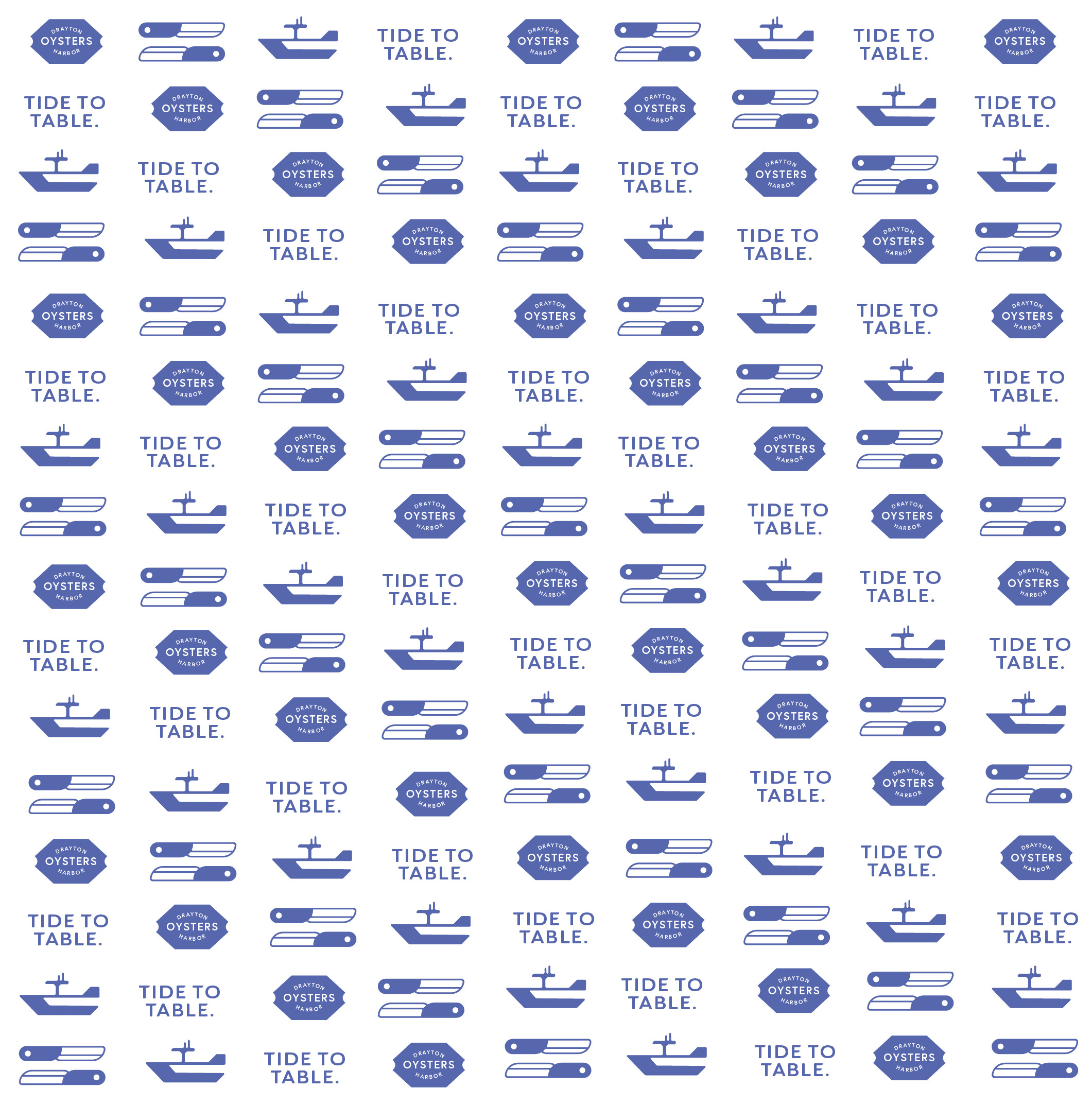
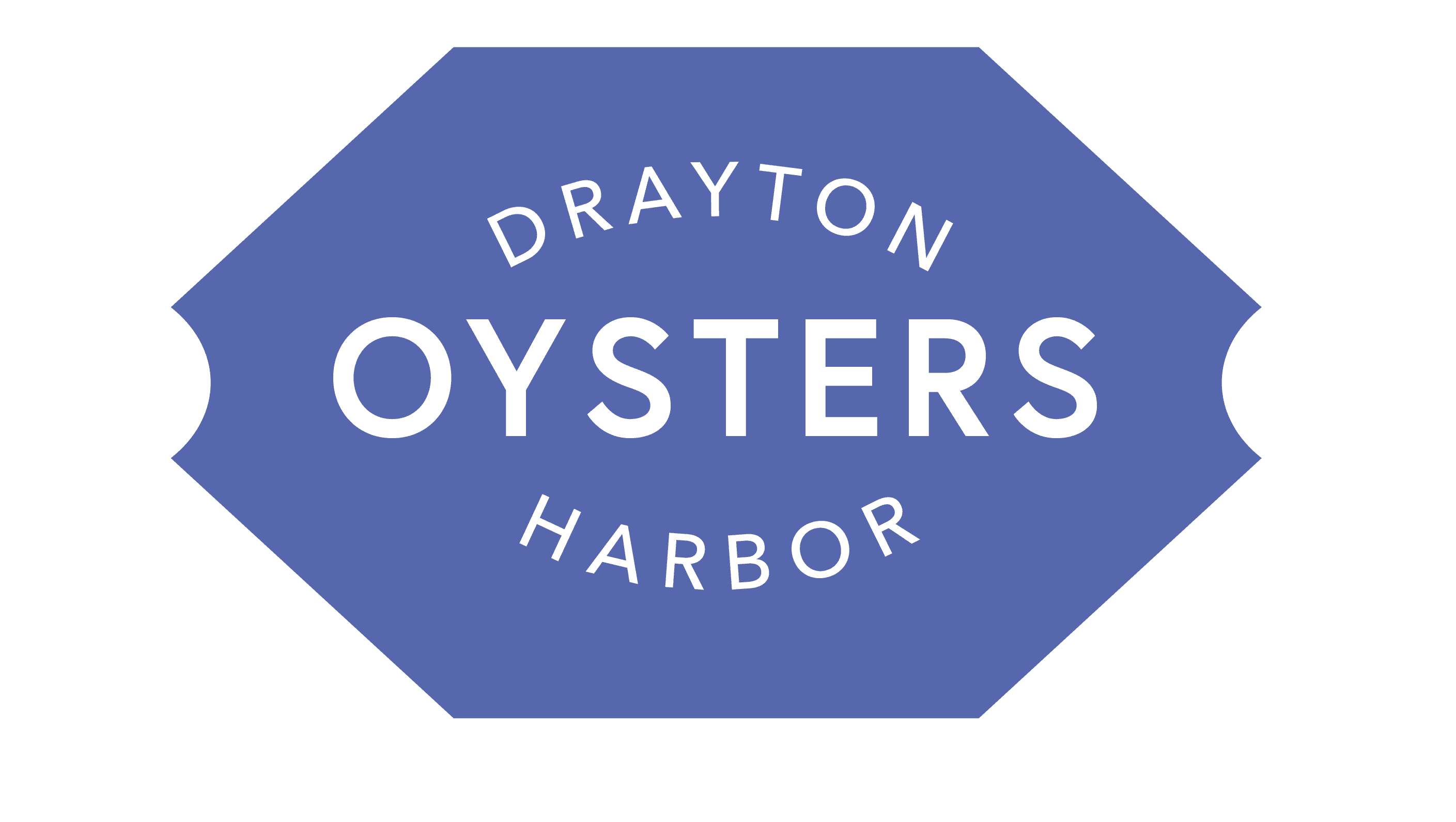
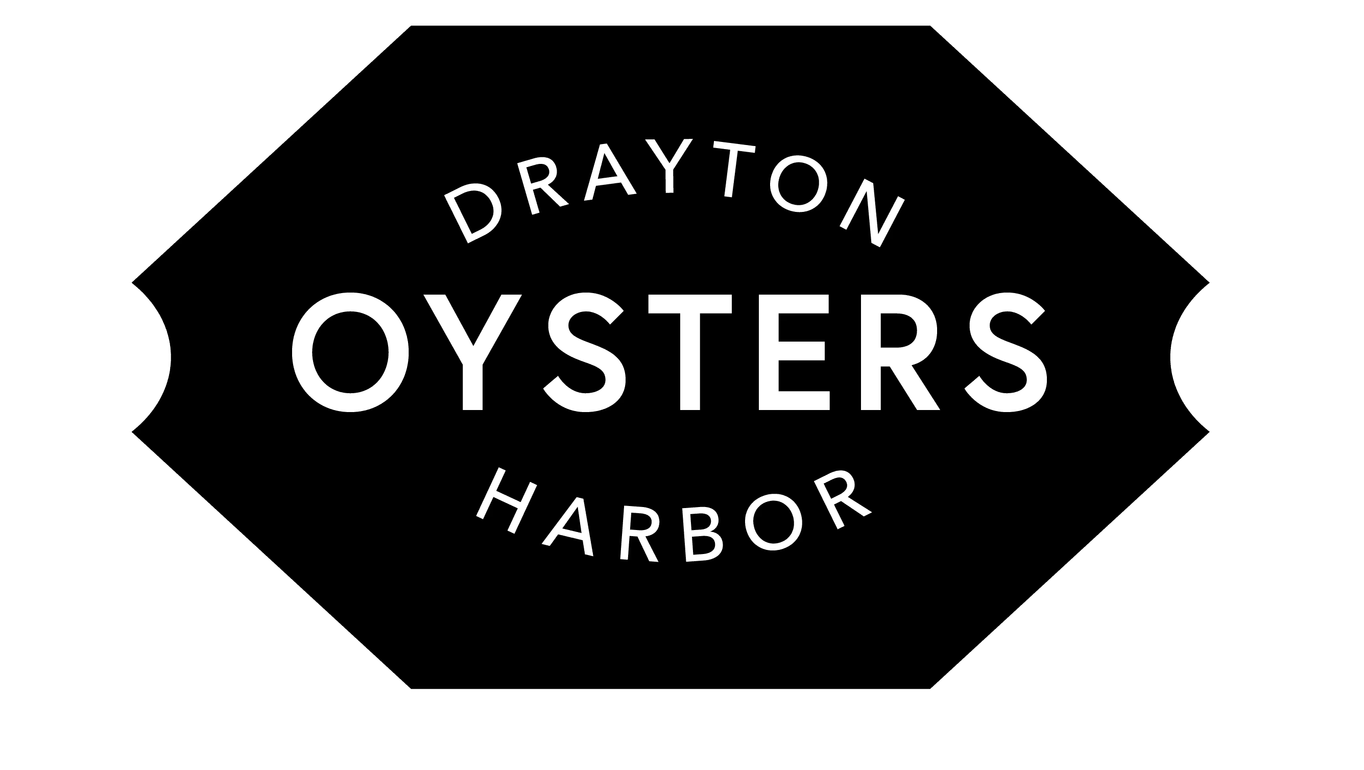
Iconography + Patterns
A simple set of icons and logo treatments to use in patterns. Easy applications in food packaging, borders, and banners.


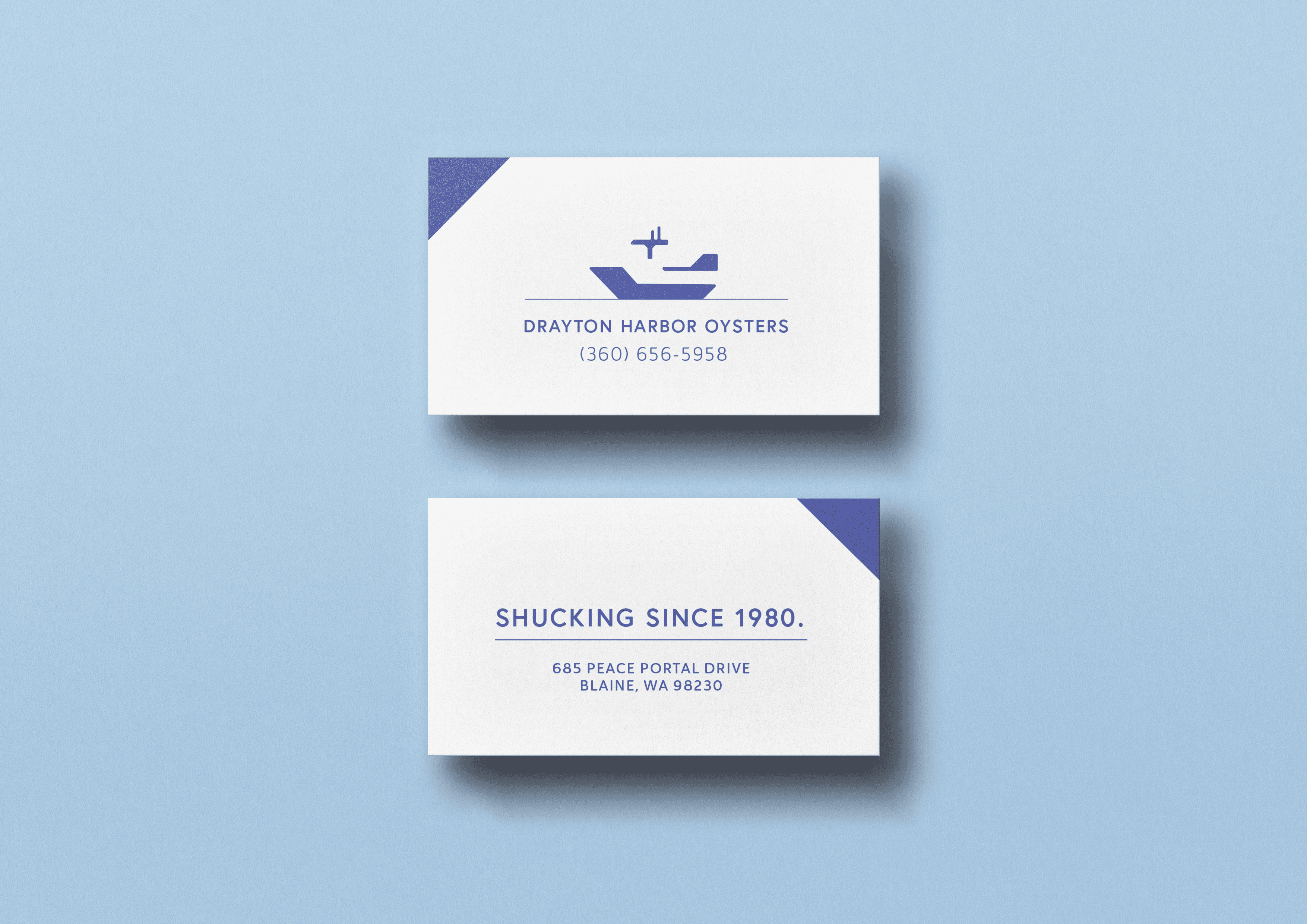
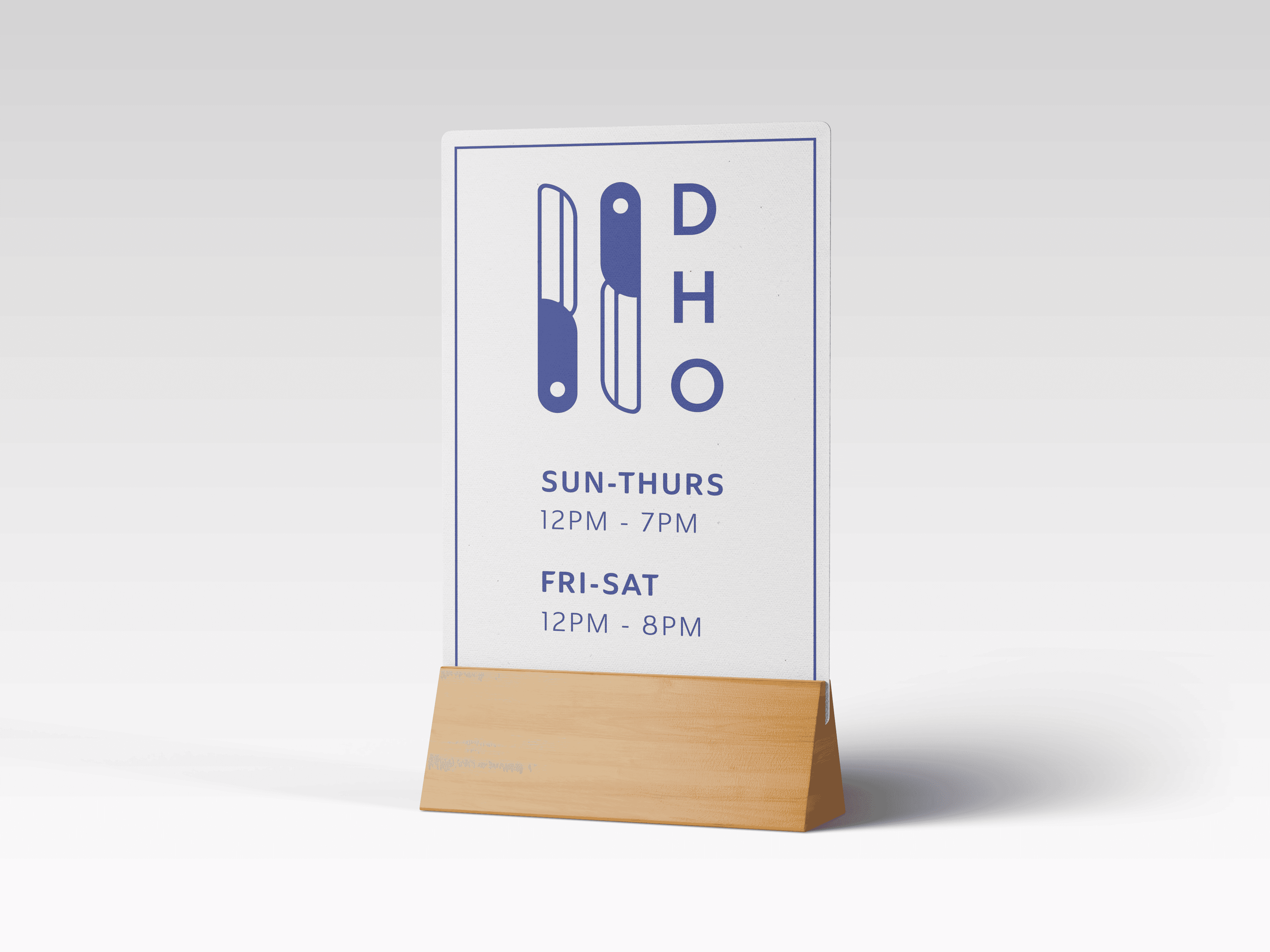
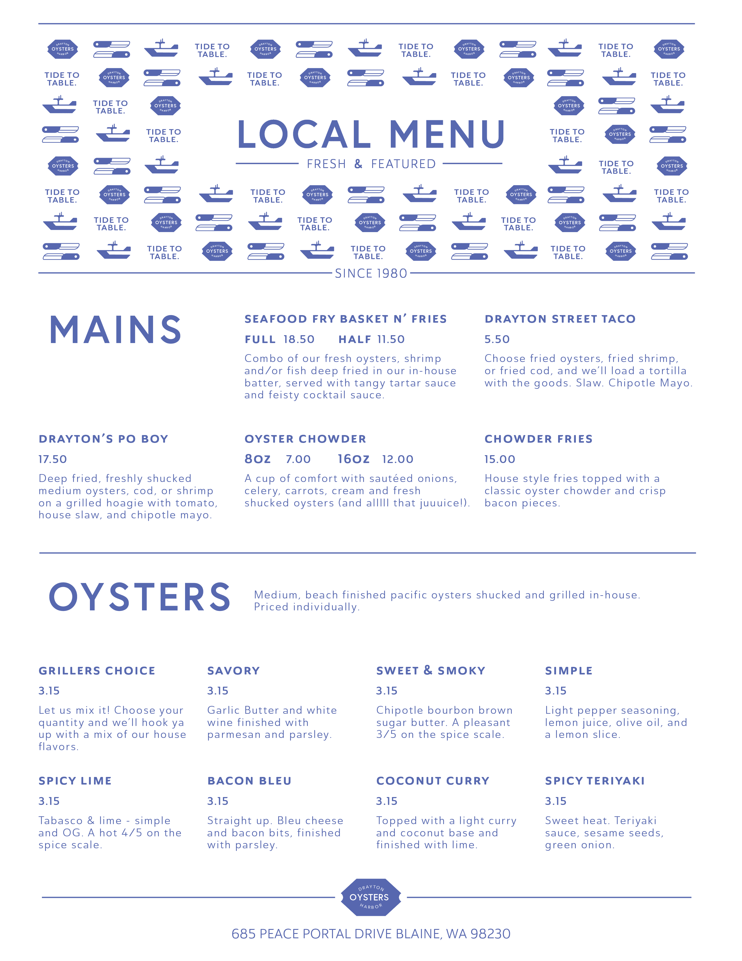

A full and digestible menu, table tents for easy information access. Business cards for catering and ordering en masse.
